I will be analysing 3 websites from artists of different genres in order to gain more knowledge on how to create a successful website.
Pop Music - Miley Cyrus
www.MileyCyrus.com
www.MileyCyrus.com

As soon as I went on Miley Cyrus' website I was greeted with a large full page advert to buy her music. As you can see, this advert is promoting her new album 'Can't Be Tamed' showing the picture used on her album cover and an offer of a 60 day free VIP pass for her website if a person buys the CD. This is an effective marketing tool, as whenever a person goes on her website they have to see this and can only get onto her website by clicking the 'x' in the corner. The offer is in the colours red and gold in order to stand out from the black and white theme of the advert. I noticed the typography used is also the same that is used on her album cover, used to link the two and keep consistency in her brand.
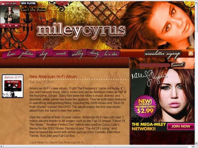
However, after clicking through and seeing the homepage of her website, I noticed that the typography here does not match her album cover at all. There seems to be no link between colours or typography, seeing as her album cover has a mainly black and grey theme with gold almost damaged looking font. This completely contrasts with her website as it has a theme of warm colours such as oranges, golds and browns. The font used for the links is a cursive font, again contrasting with the font on her album cover. This is unusual among websites, as usually the website has the same theme as the album cover, adverts and maybe even the first single's music video. Perhaps the designers have decided to use warm colours and feminine fonts in order to cater to Miley's younger target audience, which consists of mainly 11-16 year old girls.
This website seems to be very promotion based. There is a music player in the top left hand corner where a visitor can preview some of Miley's songs. However, these songs aren't from her most recent album which makes it seem like the people in control of the website haven't updated it for her newest album, which could explain the strange choice of page design. Above the music player is a link to buy her album, and on the middle right hand side of page there is a link to pay for a membership to 'Miley World', a community for Miley Cyrus fans. On the left hand side of the page there is an orange box which shows news updates, which is also heavily promotion based, not only promoting Miley's music but also artists she knows. The promotion ranges from Miley's music to her films to the awards shows she's involved in.
The navigation bar near the top on the page is pink, which was probably coloured that way in order to stand out from the background. There are 7 links in pink and 1 in grey for people to sign up for her newsletter. There is also a search box, which is handy if a visitor is looking for something that they don't think would come up under any of the links.
One thing I have noticed in relation to linking her brand together is the fact the designers have continued with the theme of the notion of looking. Miley is looking straight into the camera for most of her 'Can't Be Tamed' video, her album cover and in the picture of her on the websites background. It is also used for all her adverts for her newest album.
Although I'm sure this website was made to cater for her target audience, I don't feel its very successful at showcasing the Miley Cyrus brand. Her image right now is showing her growing up and being a young adult, whereas her website contradicts this and seems quite childish. I think it would have been more effective if the designers had kept the theme that is used on her album cover, as the adverts for her album 'Can't Be Tamed' seem out of place on her home page and don't tie in with the warm colours that have been used.
This website seems to be very promotion based. There is a music player in the top left hand corner where a visitor can preview some of Miley's songs. However, these songs aren't from her most recent album which makes it seem like the people in control of the website haven't updated it for her newest album, which could explain the strange choice of page design. Above the music player is a link to buy her album, and on the middle right hand side of page there is a link to pay for a membership to 'Miley World', a community for Miley Cyrus fans. On the left hand side of the page there is an orange box which shows news updates, which is also heavily promotion based, not only promoting Miley's music but also artists she knows. The promotion ranges from Miley's music to her films to the awards shows she's involved in.
The navigation bar near the top on the page is pink, which was probably coloured that way in order to stand out from the background. There are 7 links in pink and 1 in grey for people to sign up for her newsletter. There is also a search box, which is handy if a visitor is looking for something that they don't think would come up under any of the links.
One thing I have noticed in relation to linking her brand together is the fact the designers have continued with the theme of the notion of looking. Miley is looking straight into the camera for most of her 'Can't Be Tamed' video, her album cover and in the picture of her on the websites background. It is also used for all her adverts for her newest album.
Although I'm sure this website was made to cater for her target audience, I don't feel its very successful at showcasing the Miley Cyrus brand. Her image right now is showing her growing up and being a young adult, whereas her website contradicts this and seems quite childish. I think it would have been more effective if the designers had kept the theme that is used on her album cover, as the adverts for her album 'Can't Be Tamed' seem out of place on her home page and don't tie in with the warm colours that have been used.
Rock Music - Staind
www.Staind.com
www.Staind.com

The first thing I noticed about this websites home page was the big picture of the band performing live. This is the main background picture, and shows Staind as a band that are all about their fans. Although the colours don't exactly seem like normal colours used on a rock band's website, the picture is used to promote Staind as a real rock band who perform live and give back to their fans.
Another thing that caught my eye was the advert in the middle of the page for there most recent album 'The Illusion of Progress'. This is a Flash advert, which fades between 2 different pictures: one promoting the album, and one promoting a gig. There are click-through links for both of these adverts which leads to being able to buy the album online or buy tickets for the gig. This is a very good promotion tool as it makes it easy for people to buy what they are selling.
Staind's website ties in with the theme of the cover of their latest album cover for 'The Illusion of Progress'. The album cover consists of light cream/gold covers as the picture is has been edited to have an 'antique' or light 'sepia' tone, this is continued in the navigation bar near the top of the page which consists of 12 links - however, the same typography has not been used here. The website designers have included the bands name at the top of the page in the same font as is used on their album cover, however it is in a different cover so it stands out from the background image.
And innovative feature of Staind's website is their Twitter feed on the left hand side of the page. Here, if anyone mentions the bands name in a Twitter update this will be displayed on this feed, which updates on its own. This not only allows the band to see what people are saying about them, it allows fans to be able to see updates about the band and what other people think whenever they come on the bands homepage. I haven't seen this on any other bands website recently.
The right hand side of the page is used for promotion. There are many links to the official Staind merch store, their Facebook, MySpace and more. However, these are discrete and don't overpower the page with promotion. Other features of the page include links to videos that the band has uploaded and blog where posts from the band appear.
This website seems to hold some of the conventions that we would expect to see from a rock band, such as a black background as we scroll down, not too many bright/light colours and a very masculine typeface. I liked the fact it was only subtley promotional, I think it got the message across without being too in your face. I also liked the innovative use of the Twitter feed and Flash advert. Although this website doesn't tie in with their most recent album cover or adverts for the album, it has subtle links with it and comes across as a successful website.
Another thing that caught my eye was the advert in the middle of the page for there most recent album 'The Illusion of Progress'. This is a Flash advert, which fades between 2 different pictures: one promoting the album, and one promoting a gig. There are click-through links for both of these adverts which leads to being able to buy the album online or buy tickets for the gig. This is a very good promotion tool as it makes it easy for people to buy what they are selling.
Staind's website ties in with the theme of the cover of their latest album cover for 'The Illusion of Progress'. The album cover consists of light cream/gold covers as the picture is has been edited to have an 'antique' or light 'sepia' tone, this is continued in the navigation bar near the top of the page which consists of 12 links - however, the same typography has not been used here. The website designers have included the bands name at the top of the page in the same font as is used on their album cover, however it is in a different cover so it stands out from the background image.
And innovative feature of Staind's website is their Twitter feed on the left hand side of the page. Here, if anyone mentions the bands name in a Twitter update this will be displayed on this feed, which updates on its own. This not only allows the band to see what people are saying about them, it allows fans to be able to see updates about the band and what other people think whenever they come on the bands homepage. I haven't seen this on any other bands website recently.
The right hand side of the page is used for promotion. There are many links to the official Staind merch store, their Facebook, MySpace and more. However, these are discrete and don't overpower the page with promotion. Other features of the page include links to videos that the band has uploaded and blog where posts from the band appear.
This website seems to hold some of the conventions that we would expect to see from a rock band, such as a black background as we scroll down, not too many bright/light colours and a very masculine typeface. I liked the fact it was only subtley promotional, I think it got the message across without being too in your face. I also liked the innovative use of the Twitter feed and Flash advert. Although this website doesn't tie in with their most recent album cover or adverts for the album, it has subtle links with it and comes across as a successful website.
R&B Music - Usher
www.UsherWorld.com
www.UsherWorld.com

Much like Miley Cyrus' website, Usher's websites opening page was an advert for his two most recent albums. This gave me the impression that his website was going to be highly promotional. This page gives visitors click-through links to order Usher's 2 new albums and has his newest video playing to the left of the page. However, when I viewed this website the video wasn't working on any of my browsers. Usher's name is in a large metallic font that has a shine effect at the top, this kind of typeface has been used by Usher throughout his career and is featured on most of his album covers and adverts. At the bottom of the screen we see a link for an 'online social networking safety group' which I had not seen before on other websites, and also had text which showed who had copyright of the page (Usher's label).
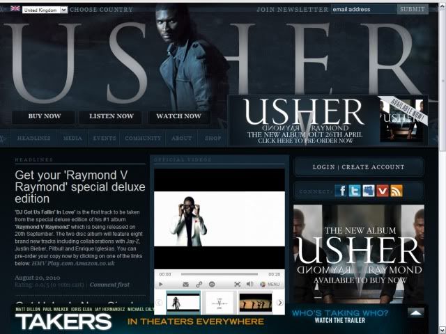
After clicking through to the main homepage I noticed a consistency in the style of the website. The deep blue colour runs through the whole website and the typeface is exactly the same for the links and the adverts for the album. There are many links on the page, 18 in total, which range from links to Usher's online social networking sites to links to preview his album and so on. My earlier thoughts of this website being highly promotional were right, with links to his music for visitors to 'buy now', 'listen now' and 'watch now'. There is also an advert at the bottom right of the page for visitors to buy his album. Most surprisingly to me was the link at the bottom of the page for the movie 'Takers'. I hadn't seen an advert for anything other than the artist on any of the other websites I looked into, so this took me for surprise. This advert also holds the same colour scheme as the site does, so it blends in and isn't garishly obvious as an advert for a movie. However, as this advert can't be closed unlike normal pop-ups it does get rather annoying when trying to navigate around the home page.
This website, unlike the others, seems very clean and tidy. It seems well planned and everything has its place, all with matching colours and typefaces. The blue theme is also transferred into the picture of Usher at the top of the screen, which again makes everything look a lot more smooth.
On the left hand side of the screen we see a box labeled 'headlines'. This shows news updates for Usher, such as information on newly released singles, appearances, videos, etc. This is once again another form of promotion.
Down the middle of the page visitors are able to watch Usher's new videos, view official photos and purchase songs from a mini 'mp3 store'. This mini 'mp3 store' is something that I had not seen on other websites and though it was a very good idea on first view. However, looking into it more this is powered by Sony Music and not a well known online music store such as iTunes, which could make people apprehensive to buy from it. Also, I feel all this promotion on the page really weighs it down and out of all 3 websites I have looked at this has been the most difficult to look around as it is so slow to load. This shows me that although all the clean page set up, matching colours and logos, videos and pictures may look really good, but the way it slows the page down can be annoying to visitors and may make them want to go on a different website.
Looking around this website I feel like it was the best looking of them all. It gave Usher a really good image and the slick design was really pleasing to the eye. However, the amount of promotion and graphics that they have used really slows the page down and this is a real let down. This is something I really need to think about if I create a website for the artist I choose to use because as I have learnt through research: If you can't catch the visitors attention in 2 seconds, you've lost them. I would not stay on a website that was really slow to load and I doubt others would too.
This website, unlike the others, seems very clean and tidy. It seems well planned and everything has its place, all with matching colours and typefaces. The blue theme is also transferred into the picture of Usher at the top of the screen, which again makes everything look a lot more smooth.
On the left hand side of the screen we see a box labeled 'headlines'. This shows news updates for Usher, such as information on newly released singles, appearances, videos, etc. This is once again another form of promotion.
Down the middle of the page visitors are able to watch Usher's new videos, view official photos and purchase songs from a mini 'mp3 store'. This mini 'mp3 store' is something that I had not seen on other websites and though it was a very good idea on first view. However, looking into it more this is powered by Sony Music and not a well known online music store such as iTunes, which could make people apprehensive to buy from it. Also, I feel all this promotion on the page really weighs it down and out of all 3 websites I have looked at this has been the most difficult to look around as it is so slow to load. This shows me that although all the clean page set up, matching colours and logos, videos and pictures may look really good, but the way it slows the page down can be annoying to visitors and may make them want to go on a different website.
Looking around this website I feel like it was the best looking of them all. It gave Usher a really good image and the slick design was really pleasing to the eye. However, the amount of promotion and graphics that they have used really slows the page down and this is a real let down. This is something I really need to think about if I create a website for the artist I choose to use because as I have learnt through research: If you can't catch the visitors attention in 2 seconds, you've lost them. I would not stay on a website that was really slow to load and I doubt others would too.
Summary
Whilst researching these websites I have learnt a few things. I think if i decide to make a website for my artist I would want to tie it in with the CD cover I would make, so everything links in with the artist brand. I would like to make the website look really clean and have everything matching like Usher's was with professional looking graphics, however I realise I would need to be careful as this could slow the page down. I liked how Staind's website was very representative of their genre of music, which is something I would definitely try to do with my website. I also liked the simplicity of Miley Cyrus' website, and would try to keep my website as simple as possible to combat the problem of slow loading.