Sunday 29 August 2010

Having a 'niche'

A niche is something that sets an artist apart from other artists, something that makes them different and will make them get noticed by record companies and investors. Upon researching this, I found that a good example of an artist with a niche is Lady Gaga.

When Lady Gaga first became well known in the music industry, there was a gap in the market for a new female popstar. With Britney Spears on hiatus from music, record industries were looking for the new ultimate female popstar, and that was Lady Gaga.


Lady Gaga's niche is her outrageous image, with over the top outfits and crazy hairstyles. Her unique vocal abilities have gained her sales of 13 million albums and 51 million singles worldwide. She is an ambassador for the LGBT community and her weird behaviour and outbursts has grabbed her more headlines than #1's in her career. She is truly the most unique artist that has been this famous in the last 10 years.

The thing that sets Lady Gaga apart from most artists in the past 10 years is her image. When she was first signed, her clothing and hair was provocative but not nearly as out there as it is now. If you watch her 'Just Dance' music video and compare it with her 'Telephone' video, you will notice she has become much more confident with her image and obviously doesn't care what anyone thinks. Her outrageous outfits have led to websites being made and 'Top 50 style' lists being written featuring her strangest ones.


Her behaviour during interviews has also changed to make her stand out more. In early interviews, she acts like a normal girl from New York who is trying to be a successful artist. As soon as she became quite famous however, she started to use an almost British accent and pretended to drink from empty tea cups during interviews. This eccentric behaviour has got her noticed by a huge amount of people and made her fan base grow immensely. People like her because she is different and tend to identify with her individuality. She claims she was an outcast in high school for being too provocative or erratic and felt like a freak, people of all ages can identify with this which makes them want to be a fan of hers.

lady%20gaga%20brings%20her%20teacup%20everywhere_o

Lady Gaga's musical niche has also got her recognised, her pop melodies are infused with glam rock sounds making her music remonisent of David Bowie and Queen. She seems to be inspired by these types of music and has based her eccentric image on these artists.

Lady-GaGa-vs-David-Bowie-lady-gaga-6424410-742-388

In order to make my music video stand out I will have to create a niche for my artist. I'm not sure whether I could use the same tactics as Lady Gaga has used to promote my artist's music, however I could try and use the idea of being different from other artists in their genre to try and catch peoples attention. I could use a variety of different techniques to stand out from the rest, as I have discovered through research what techniques are used in creating an artists niche. Techniques I could use include:

Camera Work

Every shot, angle and movement of the camera have an effect on the meaning of the video. Directors tend to commonly use close-ups of the artists face in music videos, especially well known artists. This is done to create intimacy with the viewer, but is also used as a selling point of the music, as it is emphasizing half of the commodity on sale. This means that lighting has to be carefully considered when planning these close-ups.

Movement of the camera is usually very limited when it comes to music videos, with panning shots kept to a minimum and using jump cuts to edit. To be different in my music video and to create a niche for my artist I could try and use more continuous shots and panning shots. Directors of music videos tend to try and use interesting angles to make up for the amount of jump cuts in a music video, this is something that I will also have to think about.

Editing

As I have previously said, music video generally include jump cuts instead of continuous shots, and also typically include montages. These brief images sometimes almost make it impossible to grasp the shots on first viewing. In my music video to create a niche maybe I could try and use different transitions such as fades to white or black or screen sweeps, etc.

Another commonly used technique is digital effects, these play with the original images to offer different kinds of viewing experiences for the viewer. These can include CGI, split screens, colourisation, etc. In my music video I am thinking of using a split screen, as this is something that has not been used very much in recent music videos and would make mine stand out.

Voyeurism

This idea comes from Freud, and suggests that the male viewers gaze at the screen is geared to notions of voyeurism, in that it is a powerful controlling gaze at the objectified female on display. An objectified female is often at the center of music videos and has been used to attract attention for years, however if I were to use voyeurism in my music video I would try and make it more original by possibly using screens within screens, characters watching performers on televisions or webcams, CCTV within the world of narrative, etc.

Target Audience

In order to find out more about how to promote my band or artist I will document how 3 different bands/artists have promoted their albums. I will use bands/artists of different genres and ages to see how they approach their different target audiences.

Lily Allen - It's Not Me, It's You


This CD was Lily Allen's second studio album which was released on the February 9th 2009 in the UK under Regal Recordings. It was certified triple platinum after 900,000 copies were sold. The success of the record could just be down to the quality of music that Lily produces and her loyal fanbase, however it could also be due to how she promoted the album.
  • The promotion of the album was global.
  • Upon it's release, Lily performed the first single 'The Fear' on GMTV, Friday Night With Jonathan Ross and The Sunday Night Project.
  • She also promoted the song in France performing on Le Grand Journal de Cana and NRJ Radio.
  • A wide stretch of promotion was carried out in America, with Lily appearing on many talk shows such as The Today Show, The Late Show with David Letterman, The View and more.
  • Lily also visited Australia to promote the album, appearing on talk show Rove Live and radio station Triple J where she performed 3 songs from the album. She also performed 'The Fear' on Dancing With The Stars Australia.
  • Her last international appearance was when she performed on Japan's Music Station
  • She came back to the UK and did performances on T4 and was interviewed about the album on The One Show, and performed songs off the album and old hits on Radio 1's Big Weekend and at club G-A-Y.
  • She has since continued promotion with her tour and festival performances around the world.
Lily Allen's target audience I would say is females between the age of 15-25. Her album cover would attract people of this age and gender as it is very feminine looking, with light colours and cursive fonts but isn't childish and has a sophisticated look. As she is catering for female young adults generally I think her way of promotion was good as people of this target audience would mostly use the media such as TV shows and radio shows to find new artists and this is where they would see/hear her music. Also, her tour helped her promote the album to already established fans and they would want to see any promotional appearances she made. Due to the success of the album, I feel that her way of promoting was successful.

Eminem - Recovery


This CD was the seventh studio album from Eminem, released on June 18th 2010. The album was highly anticipated after the release of his 6th album titled Relapse in May 2009. Originally titled Relapse 2, the album was meant to be released in the 4th quarter of 2009 but was put on hold until 2010, with Eminem re-releasing Relapse with extra songs on it to tide fans over. Recovery debuted at #1 on the Billboard 200 Chart, selling 741,000 copies in its first week in the US. It became Eminems 6th consecutive #1 album and despite some criticism towards its consistency, the album received generally positive reviews from most music critics and as of August 29th 2010 (2010 -08-29), the album had sold 2.32 million copies in the US. This has shown to be yet another successful album, but again this could be due to Eminem's already established fan base and popularity, or due to his promotion of the album.

  • Eminem has done several interviews in promotion for Recovery, including one with Red Bull.
  • A commercial for the album was shown during game 6 of the 2010 NBA finals, it featured Vince Offer from the well known American Slap Chop commercials in order to parody them.
  • A Call Of Duty: Black Ops commercial featuring Eminem's song 'Wont Back Down' was also released.
  • Eminem appeared amongst other artist such as Usher and Will.i.am for the Activision press conference, where him and Rihanna performed their song 'Love The Way You Lie'. Eminem also performed 'Lose Yourself', 'Not Afraid' and performed 'Won't Back Down' for the first time.
  • Eminem appeared on E! during their Daily 10 show in an interview, appeared in a skit on The Soup and also performed at the 2010 BET awards.
Although Eminem's promotion wasn't as extensive as Lily Allen's, I feel that is because he is more well known and doesn't need to promote himself as much. Then again, even though his promotion is was minimal it was effective, as the commercials were strategically aired at times when millions of people would be watching television. The commercials he did were also effective because of their content, as he parodied a well known commercial many people would be interested in watching it. When his song was featured in the Call Of Duty commercial I believe this was successful as most of his target audience (which I believe to be males aged 16-25) would be watching as this is the target audience for the game. Therefore, I believe Eminem's use of promotion to be quite minimal, but effective and strategically planned.


Madonna - Celebration


This CD was the 3rd greatest hits album from Madonna, released on September 18th 2009. It was her closing album with record label Warner Bros. Records, her label since 1982. The album debuted at #1 in Belgium, Canada, Ireland, Italy, Mexico and United Kingdom and Madonna became tied with Elvis Presley as the solo artist with the most number-one albums in the United Kingdom. As this was a greatest hits album and due to Madonna's overwhelming popularity, the album was not vastly promoted with the exception of a TV campaign, however the way in which it was promoted (much like Eminem's album) was very strategically thought out.

  • A television commercial featuring all her top hits such as 'Like a Virgin' 'Material Girl' and 'Vogue' was aired regularly getting her target audience hyped for the release.
  • In the commercial she used all the hit singles that had helped her reach different audiences, from 'Vogue' to '4 Minutes' which gave variety to her promotion as her fan base is world wide and goes across most ages. However, with her most recent albums it seems like she is trying to attract a new, younger audience as well as growing with her dedicated fans.
  • Madonna released a deluxe edition of Celebration which featured 36 songs instead of the normal versions 18 tracks and released digital bonus tracks with the deluxe edition on iTunes.
I found that this album's promotion was minimal, but as I said earlier this was probably due to Madonna's fame and because of this the album didn't need a lot of promotion, as well as the fact it was a greatest hits CD. However one thing I found quite strange was that she did no interviews for the album at all, so therefore promotion was just her TV campaign. Although the album did well in the charts I believe this was due to Madonna's dedicated fan base buying the album instead of being down to promotion, therefore I think it would've been more successful if she had done interviews and performances.

The Online Revolution

The online revolution has been both a blessing and a curse for new and established artists.

social-networking-sites

For new artists, the online revolution has provided them with a way of getting their music heard without having be on a large record label. Social networking sites such as MySpace, Facebook, Twitter and video sharing sites such as YouTube have helped unknown artists gain a fanbase.

200px-NizlopiJCBCover2

All artists nowadays use the internet to promote their music whether they be unknown or established, they just use it in different ways. Unknown artists use social networking sites and viral marketing to their advantage when trying to get noticed. A great example of viral marketing success are a band called Nizlopi. They used viral marketing to promote their song "JCB" by sending the video they had got a small production company to make for them to 10 people in an email. These 10 people then sent it to their friends and so on, soon making it a viral hit. Its success grew larger and larger, and the song ended up being Christmas number 2 in the charts.

arctic-monkeys-myspace-500x2921

Another unknown band who used the internet to gain success were the Arctic Monkeys, who put a few demos of their songs on the social networking site MySpace. Their popularity started to grow and soon local news and the BBC started to write stories about their music, they were then signed to small record label Domino Records and gained a huge fan base.

ustream-social-stream

Other, more well known artists also use social networking sites such as MySpace and Facebook to promote their music. Artists put previews of songs from their new album on MySpace so fans can listen to clips of the songs and decide whether they want to buy the album or not. They also use these sites to interact with fans, they can reply to their fans messages of use sites such as 'Say Now' to record sound messages from themselves giving their fans updates on what they're doing. A lot of artists also use YouTube to upload their latest music videos and also just funny videos they've made on tour and so on. Another new aspect of the online revolution that artists have embraced are Web Chats. Sites like www.cambio.com and www.justin.tv stream live web chats from artist that their fans can watch and ask them questions on. This is good because it allows artists to really interact with their fans and have that much more of a personal relationship with them.

spotify_app_1_480px

The online revolution has also made it possible for internet users to download music legally with sites such as 'Spotify', 'We7' , 'eMusic', 'Amazon' and music downloading programmes such as 'iTunes'. This is good for internet users, music institutions and artists because it means that the music is being downloaded legally, and it is a quick and easy way to download music. These sites are also good for downloading music on the go as most of them seem to have 'Apps' for the iPhone.

illegal_download

However, the online revolution does not come without it's down sides. Since the dawning of being able to download music from MySpace music players, torrent sites, file sharing programs such as Limewire and more, there has been a huge issue with illegal downloading. Although getting free music at the click of a button may seem good for audiences, but for music institutions this holds a huge threat to the industry and record labels lose out on millions of pounds every year because of it. With the granting of the Digital Economy Bill, artists and institutions are positive that illegal downloading can be controlled, however this has yet to be seen as internet providers and internet users are very against it and seem certain that their will be a way around it.

radiohead

One band who has used the internet to promote their music is Radiohead. For their album 'In Rainbows' they asked fans to 'name their price' for the CD. This meant that fans could pay the amount they thought the album was worth and then digitally download it for however much they wanted. This was a good marketing tool as it got great coverage in the press for being such an innovate and potentially risky idea. More and more people then wanted to try it out, making the album a success for Radiohead and helped them sell more albums in the future.

Katy_Perry

An artist who has gone down the more traditional route of promotion is Katy Perry. When she was first signed by Capitol Records their attention was focused on creating an image for her. She released her first video for "Ur So Gay" which was aimed at introducing her to the music market. A digital release of her EP which included the song "Ur So Gay" was then released digitally to create an internet buzz about her. This was successful as she was then noticed by Madonna who mentioned her in a radio interview which led to her gaining a wider fanbase. She then went on to do a 2 month tour of radio stations and then released her follow up single "I Kissed A Girl". The song became a huge commercial success and Katie Perry then embarked on the annual 'Warped Tour' music festival, which her management used to "establish her as a credible performer and make sure she wasn't seen as just a one-hit wonder".

Both of these artists were successful in their promotion which shows that their is no right or wrong way to promote and artist. It does however show that the time when an artist gets their big break is mostly due to luck or being a bit different when it comes to promotion.

Websites Part 2

I will be analysing 3 websites from artists of different genres in order to gain more knowledge on how to create a successful website.

Pop Music - Miley Cyrus
www.MileyCyrus.com


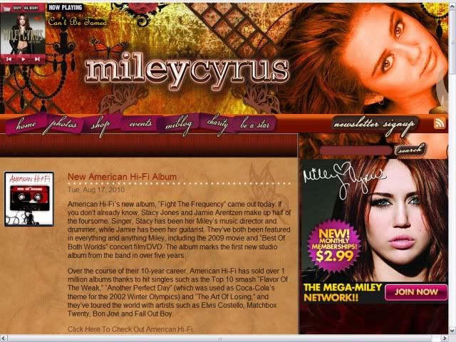
As soon as I went on Miley Cyrus' website I was greeted with a large full page advert to buy her music. As you can see, this advert is promoting her new album 'Can't Be Tamed' showing the picture used on her album cover and an offer of a 60 day free VIP pass for her website if a person buys the CD. This is an effective marketing tool, as whenever a person goes on her website they have to see this and can only get onto her website by clicking the 'x' in the corner. The offer is in the colours red and gold in order to stand out from the black and white theme of the advert. I noticed the typography used is also the same that is used on her album cover, used to link the two and keep consistency in her brand.


However, after clicking through and seeing the homepage of her website, I noticed that the typography here does not match her album cover at all. There seems to be no link between colours or typography, seeing as her album cover has a mainly black and grey theme with gold almost damaged looking font. This completely contrasts with her website as it has a theme of warm colours such as oranges, golds and browns. The font used for the links is a cursive font, again contrasting with the font on her album cover. This is unusual among websites, as usually the website has the same theme as the album cover, adverts and maybe even the first single's music video. Perhaps the designers have decided to use warm colours and feminine fonts in order to cater to Miley's younger target audience, which consists of mainly 11-16 year old girls.

This website seems to be very promotion based. There is a music player in the top left hand corner where a visitor can preview some of Miley's songs. However, these songs aren't from her most recent album which makes it seem like the people in control of the website haven't updated it for her newest album, which could explain the strange choice of page design. Above the music player is a link to buy her album, and on the middle right hand side of page there is a link to pay for a membership to 'Miley World', a community for Miley Cyrus fans. On the left hand side of the page there is an orange box which shows news updates, which is also heavily promotion based, not only promoting Miley's music but also artists she knows. The promotion ranges from Miley's music to her films to the awards shows she's involved in.

The navigation bar near the top on the page is pink, which was probably coloured that way in order to stand out from the background. There are 7 links in pink and 1 in grey for people to sign up for her newsletter. There is also a search box, which is handy if a visitor is looking for something that they don't think would come up under any of the links.

One thing I have noticed in relation to linking her brand together is the fact the designers have continued with the theme of the notion of looking. Miley is looking straight into the camera for most of her 'Can't Be Tamed' video, her album cover and in the picture of her on the websites background. It is also used for all her adverts for her newest album.

Although I'm sure this website was made to cater for her target audience, I don't feel its very successful at showcasing the Miley Cyrus brand. Her image right now is showing her growing up and being a young adult, whereas her website contradicts this and seems quite childish. I think it would have been more effective if the designers had kept the theme that is used on her album cover, as the adverts for her album 'Can't Be Tamed' seem out of place on her home page and don't tie in with the warm colours that have been used.

Rock Music - Staind
www.Staind.com


The first thing I noticed about this websites home page was the big picture of the band performing live. This is the main background picture, and shows Staind as a band that are all about their fans. Although the colours don't exactly seem like normal colours used on a rock band's website, the picture is used to promote Staind as a real rock band who perform live and give back to their fans.

Another thing that caught my eye was the advert in the middle of the page for there most recent album 'The Illusion of Progress'. This is a Flash advert, which fades between 2 different pictures: one promoting the album, and one promoting a gig. There are click-through links for both of these adverts which leads to being able to buy the album online or buy tickets for the gig. This is a very good promotion tool as it makes it easy for people to buy what they are selling.

Staind's website ties in with the theme of the cover of their latest album cover for 'The Illusion of Progress'. The album cover consists of light cream/gold covers as the picture is has been edited to have an 'antique' or light 'sepia' tone, this is continued in the navigation bar near the top of the page which consists of 12 links - however, the same typography has not been used here. The website designers have included the bands name at the top of the page in the same font as is used on their album cover, however it is in a different cover so it stands out from the background image.

And innovative feature of Staind's website is their Twitter feed on the left hand side of the page. Here, if anyone mentions the bands name in a Twitter update this will be displayed on this feed, which updates on its own. This not only allows the band to see what people are saying about them, it allows fans to be able to see updates about the band and what other people think whenever they come on the bands homepage. I haven't seen this on any other bands website recently.

The right hand side of the page is used for promotion. There are many links to the official Staind merch store, their Facebook, MySpace and more. However, these are discrete and don't overpower the page with promotion. Other features of the page include links to videos that the band has uploaded and blog where posts from the band appear.

This website seems to hold some of the conventions that we would expect to see from a rock band, such as a black background as we scroll down, not too many bright/light colours and a very masculine typeface. I liked the fact it was only subtley promotional, I think it got the message across without being too in your face. I also liked the innovative use of the Twitter feed and Flash advert. Although this website doesn't tie in with their most recent album cover or adverts for the album, it has subtle links with it and comes across as a successful website.

R&B Music - Usher
www.UsherWorld.com


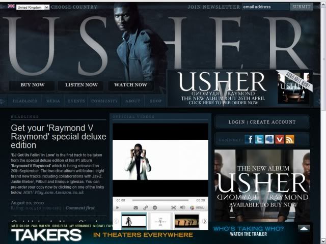
Much like Miley Cyrus' website, Usher's websites opening page was an advert for his two most recent albums. This gave me the impression that his website was going to be highly promotional. This page gives visitors click-through links to order Usher's 2 new albums and has his newest video playing to the left of the page. However, when I viewed this website the video wasn't working on any of my browsers. Usher's name is in a large metallic font that has a shine effect at the top, this kind of typeface has been used by Usher throughout his career and is featured on most of his album covers and adverts. At the bottom of the screen we see a link for an 'online social networking safety group' which I had not seen before on other websites, and also had text which showed who had copyright of the page (Usher's label).


After clicking through to the main homepage I noticed a consistency in the style of the website. The deep blue colour runs through the whole website and the typeface is exactly the same for the links and the adverts for the album. There are many links on the page, 18 in total, which range from links to Usher's online social networking sites to links to preview his album and so on. My earlier thoughts of this website being highly promotional were right, with links to his music for visitors to 'buy now', 'listen now' and 'watch now'. There is also an advert at the bottom right of the page for visitors to buy his album. Most surprisingly to me was the link at the bottom of the page for the movie 'Takers'. I hadn't seen an advert for anything other than the artist on any of the other websites I looked into, so this took me for surprise. This advert also holds the same colour scheme as the site does, so it blends in and isn't garishly obvious as an advert for a movie. However, as this advert can't be closed unlike normal pop-ups it does get rather annoying when trying to navigate around the home page.

This website, unlike the others, seems very clean and tidy. It seems well planned and everything has its place, all with matching colours and typefaces. The blue theme is also transferred into the picture of Usher at the top of the screen, which again makes everything look a lot more smooth.

On the left hand side of the screen we see a box labeled 'headlines'. This shows news updates for Usher, such as information on newly released singles, appearances, videos, etc. This is once again another form of promotion.

Down the middle of the page visitors are able to watch Usher's new videos, view official photos and purchase songs from a mini 'mp3 store'. This mini 'mp3 store' is something that I had not seen on other websites and though it was a very good idea on first view. However, looking into it more this is powered by Sony Music and not a well known online music store such as iTunes, which could make people apprehensive to buy from it. Also, I feel all this promotion on the page really weighs it down and out of all 3 websites I have looked at this has been the most difficult to look around as it is so slow to load. This shows me that although all the clean page set up, matching colours and logos, videos and pictures may look really good, but the way it slows the page down can be annoying to visitors and may make them want to go on a different website.

Looking around this website I feel like it was the best looking of them all. It gave Usher a really good image and the slick design was really pleasing to the eye. However, the amount of promotion and graphics that they have used really slows the page down and this is a real let down. This is something I really need to think about if I create a website for the artist I choose to use because as I have learnt through research: If you can't catch the visitors attention in 2 seconds, you've lost them. I would not stay on a website that was really slow to load and I doubt others would too.

Summary

Whilst researching these websites I have learnt a few things. I think if i decide to make a website for my artist I would want to tie it in with the CD cover I would make, so everything links in with the artist brand. I would like to make the website look really clean and have everything matching like Usher's was with professional looking graphics, however I realise I would need to be careful as this could slow the page down. I liked how Staind's website was very representative of their genre of music, which is something I would definitely try to do with my website. I also liked the simplicity of Miley Cyrus' website, and would try to keep my website as simple as possible to combat the problem of slow loading.

Websites Part 1

I will be researching websites in order to decide whether or not to make one for one of my 2 ancillary tasks. During my research, I have found that there are 6 points to creating an effective website:

1. Plan it out first: I must have a clear idea of what I am doing before I start, this can be done by drawing a site map. A site map includes what I will be including on each page and how I want the pages to look. This will reduce any changes that might need to be made, as any changes will create a knock on effect.

2. Think about your audience: I must decide what the purpose of the site is (e.g. to inform or entertain) and how I can attract a wide audience to it.

3. Test it out: I will enlist some friends to test my website out by asking them to do a task using the site and see if it works.

4. Navigation - clear and simple: All the links I create need to labelled properly and separate from the main body of the text so visitors know it is a link. This can be achieved by using a link bar at the top or side of the page.

5. Fonts (typefaces) and pictures: Most websites use familiar fonts as anything over than a basic font needs to be inserted as an image. I need to consider how many images compared to text I have on the page so I do not overload it with images, as this will affect how quickly the page loads.

6. Homepage: This is like the 'shop face' of the website and if I haven't got my audiences attention within 2 seconds they will not want to look at the rest of the website and click onto another site. I have to consider what the most important bits of information and put them on the homepage. I should also consider the amount of white space compared to visual clutter.

Web 2.0 - The next generation of the internet.


Web 2.0 is the World Wide Web being used as a platform for cheap and easy ways to share images, files, videos and experiences. The tools haven't changed, but there has been a shift in the way people use the web. For example, businesses are using social networking sites such as Facebook and Twitter to advertise products and services. It is predicted that in the future design will be done by teams rather than individuals.

The new age of online blogging enables everyday people to spread the news by weblogs, MySpace, Facebook, Twitter and YouTube. This has proven to be a powerful propaganda tool and shows how the way we seek and receive news is now changing because of the online revolution.

The way websites are made is rapidly changing as people are getting bored of seeing the same old thing. Websites that have been designed in light of this are Nike's website and Ebay. Nike have innovatively blurred the lines between a website and a TV commercial on their site, claiming they want the audience to 'experience' as well as purchasing the product. Ebay allows the user to customize their homepage according to what they want to fast access to.

Website Terms


- Cookies - These allow websites to remember your details so you don't have to re-enter them when you return.

- Tabs - These are the links as the top of the webpage.

-Really Simple Syndication (RSS) - If you are interested in a particular article this feature allows any related articles to be sent straight to you.

- Citizen Journalism - This refers to everyday people who are creating blogs, MySpace pages and Twitter updates and YouTube videos to spread the news. This is the future of the internet.

- Transferability - This means creating a corporate identity so that a website links to a CD cover and a magazine advert promoting the band and a music video.

- Roll-overs - These are pictures that change when your curser moves over them.

- Interactivity - This is when you allow users to actively participate in your webpage.

- Scrolling Marquee - This is text that moves across the page.

Branding

For an artist, creating a brand for themselves is very important. This is usually done by creating a logo or image that is associated with the artist and placing that image on their merchandise, becoming an instantly recognisable image for the artist.

However, this is not the only the only thing that makes up a brand. A brand can be a logo, an attitude or a look. A band who understood this very well was The Beatles with their unusual haircuts, Nairu jackets, Beatle boots and humor.

Nowadays, artists and bands tend to use all these aspects to create a band for themselves, from merchandise to their image. I will be researching how bands brand themselves through merchandise, where these products are sold, for what purpose are they designed, how do they work to establish a brand identity and how successful is the merchandise.


Red Hot Chili Peppers are a band that have a band logo which they put on most of their merchandise, including CD's, posters, badges and apparel. These are some of the items I found on the 'store' section of their website:


These pieces of merchandise are designed with the Red Hot Chili Peppers' logo not only for fans to show their love for the band, but to also promote the band themselves. If a member of the public sees another person wearing one of these pieces of merchandise, they will remember the logo and possibly look up the band name, which could perhaps lead to gaining new fans.

The logo itself helps to establish a brand identity for the band because it becomes an instantly recognisable image for the band. Whenever a person sees the image, they will instantly know that the Red Hot Chili Peppers are associated with whatever the image is used on. This could be used to not only help the band gain new fans, but also gain any institution they are affiliated with more popularity, as a fan of the band would want to be a part of anything they are a part of.

I would say this merchandise is successful as the logo is recognisable, fans would want to buy this merchandise as it clearly shows people they are a fan of Red Hot Chili Peppers and it is recognisable as the bands logo, instead of just a random image or pattern.

--


Another band's merchandise I will be researching is 30 Seconds To Mars. This band is slightly different in their approach to branding, as they do not have one set logo like Red Hot Chili Peppers. After touring the 'store' section on their website I found that they used many logos for their merchandise:


Again, much like Red Hot Chili Peppers these pieces of merchandise are made not only for the fans, but also to help promote the band. However, I do not think that this bands use of branding is as effective. This is because they have so many different logos instead of just one main one which everyone can link the band with. This could lead to confusion among not only the fans but people who keep seeing these logos and think they are for different bands.

This could also be a plus for the band however, as their range of logos and images gives variety to the fans, seeing as they seem to change their logo each time a new album is released. This shows that the band is not just one set brand, but a brand that is forever changing and revamping their style and sound, keeping up with their growing fan base.

In my opinion, 30 Seconds To Mars' merchandise does give the buyer a range of merchandise to choose from with each piece being different from the next, however I do not believe this is successful for their brand. I think it would be better for a band to have a set logo that can be printed onto many different pieces of merchandise so that it is instantly recognisable as the bands logo, like Red Hot Chili Peppers. This is something that I will carefully consider when trying to make a brand for my artist, possibly by choosing a specific symbol to represent the band or choosing key house colours to use across all my promotional material.


Thursday 26 August 2010

CD Cover Designs

I will be researching 5 different CD cover designs in order to find out more about how an arist/band promotes themselves and their CD using the cover. This will also help me research how to put a CD cover together in case I choose to do that for one of my ancillary tasks.

As the album is the main thing that an artist is promoting it has follow certain conventions, such as creating a brand for the artist. This usually consists of relating the album cover to all different forms of promotion for that artist, such as using the same colours on the album that are used on the artist's website, posters, adverts, etc. The typography used should also be the same as what is used on those other forms of promotion, in order to create a brand for the artist. As the cover is the forefront of what the artist is selling, this (in theory) should tell the audience a bit about the artist, sometimes showing the artist's face, however this is not always the case.

I have chosen to analyse album covers for different genres of music, I believe this will give me broader knowledge of what CD covers are like across genres.


Adult Pop Music: Britney Spears - Circus

2qbexc5


Teen Pop Music: Selena Gomez and the Scene - Kiss & Tell

album 5


Rap Music: Eminem - Recovery

album 4


Rock Music: The Used - In Love and Death

album 3


Pop Rock Music: 3OH!3 - Want

album 2

I noticed whilst analysing these that although aesthetically they may look different because of their different genres, most of these album covers hold the same conventions. They all seem to share the same typography and colours as they do with their other forms of promotion (websites, posters, TV adverts), so that is something I will think about when designing my CD cover. Two of the album covers I analysed do not have the artists on the front, so this again is something I will have to consider (whether or not to put my artist on the front cover).

Goodwin's theory - Close ups of artist/the notion of looking

  • The demands of the record label will include the need for lots of close ups of the artist and the artist may develop motifs which reoccur across their work
  • There is frequent reference to the notion of looking, and particularly voyeuristic treatment of the female body
A good example of an artist who uses lots of close ups and has developed a motif that reoccurs across their work is Lady Gaga. In her video for 'Bad Romance' there are frequent close ups of her because she is a well known artist and her image sells. Motifs she has also developed are her unusual dance routines and (most notably) her unique style of clothing. Throughout the video there are frequent shots of choreographed dance routines in her usual style and numerous outfit changes, with each garment being very individual and different from the last. These motifs have made her videos instantly recognisable, and they have made her recognisable as an artist creating the Lady Gaga brand. In this video we also see evidence of 'the notion of looking' as she is directly looking into the camera as she lip syncs. This engages her with her audience and makes the video more personal, making the audience feel like she is directly looking at them.


Another artist who uses both these theories is Miley Cyrus. In her video for "Can't Be Tamed" there are extremely frequent close ups of her lip syncing to the song. This, again, is due to her being a brand, and close ups of her sell the video and the song. We also see 'the notion of looking' put into play, as she is constantly looking into the camera throughout the video which again engages with the audience and makes them feel like she is directly singing to them. Another interesting use of 'the notion of looking' is the fact that in the beginning she is seen as a rare bird in a cage with the audience staring at her, also some audience members are using binoculars to look at her which is another reference to 'the notion of looking'. The shots of her as a rare bird in a cage are a metaphor for how she is constantly watched upon by the media and the public eye, and her breaking away from the cage is a metaphor for her wanting to break free from the media spotlight.


Goodwin's theory - Relationship between lyrics/music and visuals

  • There is a relationship between lyrics and visuals
In class we were given a task to do to explore Goodwin's theory that there would be a relationship between lyrics and visuals. We were given a story boarding sheet and asked to listen to the song 'Here Goes The Fear' by Doves. We were then given the lyrics to the song and asked to storyboard what we thought the video would look like if we matched the lyrics to visuals. This is what I came up with in the short time we had:


storyboard yo


We were then shown the actual video for the song and saw that although the video did not literally interpret the lyrics of the song (aka it did not amplify the lyrics), it subtley illustrated them using metaphorical imagery.


We see this when the man opens the door at 0:58 this represents the releasing of the fear, this also shows a relationship between music and visuals in this shot because just as the music gets loud the door springs open. This has shown me that lyrics do not have to literally be interpreted in the music video, and that there can just be subtle hints at them, making a music video that much more interesting.

Goodwin's Theories

Andrew Goodwin published a book in 1992 called "Dancing In The Distraction Factory" which explained his theories on music videos. In the book, he made 6 points which he thought every video encompassed:

1. Music videos demonstrate genre characteristics (e.g. rock music videos are usually performance based, etc).
2. There is a relationship between lyrics and visuals (either illustrative, amplifying or contradicting).
3. There is a relationship between music and visuals (either illustrative, amplifying or contradicting).
4. The demands of the record label will include the need for lots of close ups of the artist and the artist may develop motifs which reoccur across their work.
5. There is frequent reference to the notion of looking, and particularly voyeuristic treatment of the female body.
6. There is often intertextual reference between films, TV programmes, and other music videos.

I have already researched Goodwin's 6th point in my previous post but will continue to research these points in order to help plan for my music video.