Sunday, 19 December 2010
Editing and Things Changed

Editing has generally gone well and I have been able to stick to my storyboard quite well apart from changing the last 'expectations vs reality' scenes from the study room scene to the scene where Katie is waiting for a friend to turn up so they can go out, the friend turns up in her expectations but in reality she bails on Katie with a lame excuse. I have also added more shots of Katie lip syncing to the song as advised by my teacher, to make it look more like a music video instead of a short film.
There were two main issues I found when editing, the first being the split screen. When I had filmed my original footage, I had made sure that all the action was in the center of the frame in case the split screen cut off the sides, therefore my shots looked like this:
Before

After

Before

After

Before

After

After
Before
After
Before
After
I felt this only really affected the study room scene, especially in the shot where Katie is meant to look like she's sitting on her own with everyone talking with their friends around her. As the split screen cut off most of the people sitting around her I felt it didn't give the same effect, and with no time to re-film I decided to cut it from the video and only use this footage in the flashback montages. This, thankfully, did not affect the music video that much in the end as by the time I would have added that scene I would have run out of song time to use it anyway. I replaced this scene with the scene where Katie goes out with a friend in her expectations but in reality is stood up.
Another issue I faced was not being able to use transitions moving into the split screen scenes or after. When trying to do this, I was able to add the transition but it just ended up being a grey box on the editing screen and wouldn't work in playback. After researching, I found that this was not a bug or a problem with my iMovie but just the way it has been made. This unfortunately is very limiting for me, as I would have liked to use a cross blur, dissolve or circle open transition before and after these scenes to show they were flashback, however I have made sure to use the black and white effect on these scenes to make it clear to the audience that they are flashbacks.

I was able to use transitions in normal scenes however, such as a lot of flashing transitions made by using the 'fade to white' transition to use Goodwin's theory of matching the lyrics to visuals e.g. "When your life flashes before your eyes will it be beautiful?".
I also felt the 'singing in the field' shots didn't stand out enough, and so have used a vignette effect to make them darker around the edges, making Katie stand out more and making the shots look more dramatic.

I have also added the "Expectations Reality" titles to the split screen scenes, making the font white in order to stand out with the black and white and also to go with my house colours of white, black and green.

Lastly, I decided to speed up the 'twirling round the field' shot and splitting it into 3 sections, making the first clip 70% speed, the second 160% speed and the third 250% speed. I did this so that it sped up with the music using Goodwin's theory of matching the visuals to the music. I also used a 'dream' effect on these shots to make it seem almost as if Katie is glowing, giving it an angelic, supernatural feel which I felt went well with the soft music that went with that shot.

Hopefully the next thing I post will be my finished music video.
Things Changed From Storyboard
I changed the last 'expectation vs reality' scene. Originally it was the study room scene, however as I have stated earlier I had editing problems with this scene and therefore replaced it with the scene where Katie gets stood up by a friend. Also, upon showing my teacher the footage I had first filmed in the field, she advised I get some more angles. Therefore I have more angles for the lip syncing scenes than is stated in my storyboard. I have also added lip syncing scenes in between shots for the 'expectations vs reality' scenarios so that it still looked like a music video and not too much like a film.
I changed the last 'expectation vs reality' scene. Originally it was the study room scene, however as I have stated earlier I had editing problems with this scene and therefore replaced it with the scene where Katie gets stood up by a friend. Also, upon showing my teacher the footage I had first filmed in the field, she advised I get some more angles. Therefore I have more angles for the lip syncing scenes than is stated in my storyboard. I have also added lip syncing scenes in between shots for the 'expectations vs reality' scenarios so that it still looked like a music video and not too much like a film.
Sunday, 12 December 2010
Finished Digipak and Magazine Advert
My original idea for the CD cover was to take two pictures of Katie, one with the left side of her face looking as if she'd been crying, and one with the right side of her face looking happy. However, after doing this I found it extremely hard to line up both sides so they matched and looked like just one picture. Therefore to overcome this I decided to just use one picture that I had taken of her whole face looking sad, and edit the right side of her face to look happy.
This is the photo I used

In order to edit the right side of the face I used a program called 'Sugar' which is a make-over program I used to make the make-up more dramatic with fake eyelashes and more eyeliner on the right have of her face and modified her mouth to look like she was smiling on that half.

I then cut the image in half and placed it onto the template I had made for the album cover where there was a line separating them, carefully lining them up so that the face was even.
This is the end result:
Front cover

After measuring digipaks that I own myself I found that they are roughly 14cm by 12.5 cm, and therefore this is the side I used for my front, back and inside covers.
Front cover
After measuring digipaks that I own myself I found that they are roughly 14cm by 12.5 cm, and therefore this is the side I used for my front, back and inside covers.
My other ideas went well and I was able to follow the plans I had previously posted without any problems.
Back cover

Inside left panel - lyrics booklet

Inside right panel - CD holder

Back and front cover together

Inside left and right panels together

I took careful consideration when choosing what industry information to use, and what record to label my artist would be signed to. After researching I found that Sire Records may be the best seeing as they are an independant label dealing with pop rock/alternative artists much like Snakes Hate Fire. They also bought out the soundtrack for the film (500) Days of Summer, which my music video took it's inspiration from. The producer I chose is Matt Grabe, as he has produced a lot of the artists on Sire Records' albums, and these artist seem to be similar to Snakes Hate Fire musically. I have also included websites and social networking sites for the band and their label, as I have seen this a lot on CD covers I have researched such as:
Taking Back Sunday

Jack Johnson

Jack Johnson
Therefore I decided this was a vital piece of information to use on my digipak back cover. Although on these CD's they only show the band's website and the label's website, I felt it was important to include social networking sites seeing as my target audience would be more likely to look at the bands facebook/twitter/myspace instead of going on the actual website.
Inside left panel - lyrics booklet
Inside right panel - CD holder
Back and front cover together
Inside left and right panels together
My magazine advert was also successful however I split the lower right box into two for the 'Featuring the hit singles' and instead of putting stores in which the album could be bought, I decided it would be better to put where the album could be downloaded as my target audience are more likely to download music online rather than going out and buying CD's. In an earlier post I also suggested that I might use a different picture on my magazine advert than the one on my digipak cover. However, upon further research I found that artists tend to use the same artwork from their CD covers on their adverts, and therefore decided to go down this route instead. Examples of artists I researched are:
Ellie Goulding - 'Lights' album

Ellie Goulding - 'Lights' magazine advert

Goo Goo Dolls - 'Let Love In' album

Goo Goo Dolls - 'Let Love In' magazine advert

Ellie Goulding - 'Lights' magazine advert
Goo Goo Dolls - 'Let Love In' album
Goo Goo Dolls - 'Let Love In' magazine advert
I also felt that this would be a better idea as to create a brand identity.
Magazine Advert

The magazine advert is A6 in size, as this size better suited the design and when looking through magazines I found that for an artist that is not very well known or on an indie label they usually have a smaller advert than a full A4 page.
Brand Identity
I have been able to create a brand identity successfully I feel by creating a theme of split screens throughout my music video and ancillary tasks. This enables people to connect the digipak and and magazine advert to the music video, recognising my artist. I have also used the same typography and house colours throughout my ancillary tasks, making sure to connect them to the music video. I have kept a theme of 3 house colours and 3 fonts, as I have been taught that it is a convention of CD covers to use no more than 3 fonts and colours in order to not overwhelm the promotional material. This has allowed my ancillary tasks to remain simple and pleasing to the eye, again connecting with the theme of my video.
Sunday, 28 November 2010
Filming Diary Day 7
After showing my teacher what I had filmed so far it was thought that I may need more shots of my character lip syncing, therefore I decided to have an extra day of filming in the field to get some more of these shots. I decided to take shots of Katie lip syncing the same place from multiple different angles - a long shot, a medium long shot, a close up, and then a medium close up from her right and one from her left whilst she was still lip syncing facing forward to give the illusion of multiple cameras. I also took some footage of some filler shots, such as her looking up at the camera and smiling or looking up at the camera and shaking her head. I also re-filmed the opening shot of her walking towards the camera whilst zooming out, in order for her to lip sync during that shot.
Issues faced during filming
As it is winter and we had originally filmed a couple of weeks ago, most of the trees had started to lose their leaves now and houses were visible behind them, which didn't look very professional. However this was only an issue in the re-filming of the opening shot, which isn't essential to be used and I could just use the original if it doesn't look good when it comes to editing.
There was also an issue of lighting, which could be a problem with continuity as the lighting went from very sunny to overcast. However if this is an issue I can always make the shots more contrasted during editing to give the illusion of sun.
I had planned on doing some more filler shots of Katie walking through the trees and a low angle of her lip syncing, however it was extremely cold (around -1°C) and after filming for an hour the cold became unbearable and we were unable to film anymore. Especially seeing as Katie was wearing a strapless dress, sheer tights and dolly shoes, I think we did well to last an hour. Luckily, these shots were not essential and just extra footage just in case so it wasn't essential that is be filmed.
--
Other than those weather issues everything else went to plan. Hopefully I won't need to film anything else now and can concentrate on editing.
Monday, 22 November 2010
Digipak Continued
I will still be going with the same theme for my digipak cover that I posted in my previous digipak cover idea post. I have decided to go with the idea that I anotated on the picture, of having a picture of the girl in my video's face, with the left side crying with smudged make up and the right side perfectly made up smiling.
I will be using two pieces of software to make my digipak, Serif Page Plus and PhotoScape. I will be using PhotoScape to edit my photos and Serif to actually assemble my digipak.
As I will need 4 panels for my digipak (the front and back cover and inside right and left panels) I have made plans for both of the inside panels of my digipak and the back cover. After measuring some digipaks that I own myself, I have found that each panel will need to be roughly 14cmx12.5cm in order to be the right size for a digipak.


I have chosen to use the font 'Papyrus' for the word 'Heartbreak' on my front cover, as it has a shakey, broken look to it that I feel fits with the theme.

I will be using 'French Script MT' for the word 'Beautiful' as it has an elegant, pretty and classy look that I, again, feel fits with the theme.

I am using two fonts to show the two sides of a situation, like I have done in my music video.
I will also be using the font 'Verdana' for the band name because it is bold and stands out. It also has a simplistic clean look which is what I am going for with the album and magazine advert.

I will be using two pieces of software to make my digipak, Serif Page Plus and PhotoScape. I will be using PhotoScape to edit my photos and Serif to actually assemble my digipak.
As I will need 4 panels for my digipak (the front and back cover and inside right and left panels) I have made plans for both of the inside panels of my digipak and the back cover. After measuring some digipaks that I own myself, I have found that each panel will need to be roughly 14cmx12.5cm in order to be the right size for a digipak.


My idea for the track list on the back cover is that the song names will cascade vertically on alternate sides of the line, looking like a vine. On the left side will be the 'heartbreak' songs (the sad songs) and the right will be the 'beautiful' songs (happy, more upbeat songs). I feel like this is an interesting idea that I have yet to see anywhere else during research and think it ties in with my theme really well, helping to create a brand identity.
Seeing as my music video will consist of the colours green, white and black, I have decided to use these as my house colours and therefore all images or fonts will consist of these colours, apart from the image on the front cover which will be a close up of Katie.
I have chosen to use the font 'Papyrus' for the word 'Heartbreak' on my front cover, as it has a shakey, broken look to it that I feel fits with the theme.


I will also be using the font 'Verdana' for the band name because it is bold and stands out. It also has a simplistic clean look which is what I am going for with the album and magazine advert.

I will update with any changes to my plans.
Filming Diary Day 6
Unfortunately I was unable to film today due to rain, I have rescheduled to film on Friday 22nd November. This may have worked out to my advantage however, as today me and my actress would have had to try and rush the filming during our free period and lunch, whereas on Friday we will have an inset day meaning we will have all the time we need to get the shots. Hopefully the weather will be better by then, otherwise I might have to just try and work with the footage I have already got.
Sunday, 21 November 2010
Filming Diary Day 5
I was unable to film on this day due to illness, and upon review of my footage I feel that adding another situation scene may be too much and instead I should get some more footage of Katie lip syncing in the field to break up the situations a bit more. Filming for this should be commencing on Monday 22nd November, weather permitting.
Saturday, 13 November 2010
Filming Diary Day 4
Today I filmed the field scene, in which the character is lip syncing to the music. There were a few issues I faced during filming, including:
Traveling Issues
- Due money and not wanting to lose too much light I decided it would be easier to the filming in my local field, Pinehill Field. This field gets less people walking through it than the one originally chosen in Luton, as it does not have a playground. Therefore I believe this was a better location in the end, and gave me some really nice shots to work with.
Weather
- Ideally, I wanted the weather to be sunny when I filmed. In the morning the sky was clear and the weather forecast was sunny, however once my actress (Katie) and I got to our location it was cloudly and extremely cold. As my actress was wearing a strapless dress during this section of filming, we could not film for more than an hour and a half due to the extreme cold.
- The field was also very muddy, which made it extremely difficult to do all the shots I had hoped to do (including the character spinning, running across the field, etc), therefore these had to be substituted with walking shots and shots of the character lip synching static. However, I was able to do most of the shots I had planned and was able to creatively use the focus on my video camera in order to keep Katie in focus in certain shots and the background blurry, making her stand out whilst lip synching. This, I believe, will look very good in the final product.
I may be able to go back to the field and film some more if I do not have enough footage, this will be decided whilst editing and any additional filming days I decide to add will be updated on future posts.
Friday, 12 November 2010
Filming Diary Day 3
Again, due to the weather I was unable to film anything I had planned today, which was the scene in town where the characters expectations are that she would be meeting a boyfriend in town, when in reality she is sitting alone. The other shots planned for that day where the field scene in which the character would be lip synching. These scenes have now been changed and my shooting schedule has been changed accordingly:


Monday, 8 November 2010
Filming Diary Day 2
Due to weather conditions I was unable to film the scene I had planned to do in the town center today. This has been rescheduled to Thursday at 12:30, any ammendments to other shoots made will be put on later posts or on an updated shooting schedule.
I was however able to film the school scene in which the characters expectations are that she has lots of friends and she's talking to them in a group, when in reality she's sitting on her own watching the surrounding people talking to eachother. There was only one issue I thought of whilst filming:
Other than that there were no problems whilst filming.
I was however able to film the school scene in which the characters expectations are that she has lots of friends and she's talking to them in a group, when in reality she's sitting on her own watching the surrounding people talking to eachother. There was only one issue I thought of whilst filming:
Room size
The room I used was rather small and so there may be an issue when it comes to editing where the edges of the shot will be cut off to fit in the split screen and therefore I will lose the majority of my extras, if this is the case I will need to refilm in a larger room.
Other than that there were no problems whilst filming.
Saturday, 6 November 2010
Actress Choice and Final Storyboard
The actress I will be using in my music video is Katie Glenister. I chose her because she has a history of acting experience, and has also been in a band herself in the past where she appeared in videos and would therefore find it easier to lip sync to the song. She is also a very mature, organised, and reliable person which I think are valuable qualities that I will need in an actress for my music video, as if I planned to shoot one day and my actress canceled on me at the last minute this would make me behind with filming.


Other actors I will be using will be extras for the study room scene, which will consist of friends that I have already asked and will arrange for them to be in there when I need to film. I will also be enlisting the help of my friend Adam to play Katie's boyfriend in one of the scenes.
--
Final Storyboard
I have put my final storyboard into a PowerPoint however some of the notes may be hard to read so I will also post the original images. Changes I made from my original draft storyboard are that I took out the 'matrix' style shot and the end cloning shot, because of the feedback I got from my music video pitch and the fact that I found I would need at least 4 cameras to achieve the 'matrix' style shot. Although my storyboard is not in colour, I have realised the main colours of my music video will be green, black and white and I will make these my house colours and include them in my ancillary tasks. I have also changed my blog colours accordingly.


Filming Diary Day 1
Today was my first day of filming and I was lucky enough to shoot everything I had planned in my shooting schedule and an added scene. However I underwent some problems in filming such as:
The time I allowed on my shooting schedule to film was not long enough to set up and film each scene and therefore I ran over into other filming time slots. Therefore, I will have to amend the timing of future shoots (possibly filming earlier than I had planned), especially if I have a limited amount of time to film in.
Lighting issues
I originally planned to film the university acceptance/rejection scene in the living room, however the lighting was poor and would have made the film grainy and so I decided to move this scene to the dining room as it has patio doors which allowed for more natural light.Angle/framing issues
This also made me have to change the angles of shots, such as originally there would have been a shot of the character walking down the stairs filmed from the bottom of the stairs but this had to be changed due to the 180 degree rule. I also had to change what room I did the 'Facebook in a relationship/single' situation as my desk didn't have enough room to frame the shot, so instead I used my parents' office.Time taken to complete scenes
Added scene
During filming I had an idea for a scene where Katie would be sitting in the living room waiting for a friend to pick her up to go out. In her expectations, the friend turns up and they leave the house to go out however in reality she gets a very blunt text from the friend saying she can't go out anymore at the last minute. We decided to film this with me playing myself as Katie's friend, using the tripod to film. The scene worked really well and I am thinking of adding this as the last situation used in the music video.
Shooting Schedule
I have devised a shooting schedule for my music video. I have taken into consideration when will be appropriate times of the day to shoot each scene, and when my actress would be available to film. Any changes made to my shooting schedule will be updated in later posts.

Thursday, 28 October 2010
Magazine Advert Ideas
In continuing my theme of split screens and wanting to create a brand identity, I will use a similar layout for the magazine advert to my album cover. However, I will possibly be using a different picture in order to not make them look too similar. I will also be adding additional information in the magazine advert, such as three panels for tour dates, singles featured on the album or for where people can download/buy the album and a panel that will say the albums release date. This is my flatplan for the magazine advert:


I will be using the same house colours and typography for all of my promotional materials in order to create a distinct brand identity that will be recognisable to fans and potential buyers.
Another idea I have thought about is still splitting the advert into two sides like the split screen I will be using in my music video, but instead making the left half of the page a picture of the character lip synching in my video and then the right side having all the information including tour dates, album release date, featuring singles, etc.
Digipak Cover Ideas
After discovering I would be able to use my idea for 'Heartbreak Beautiful' I started thinking of ideas for my digipak cover. As I have previously said, I will continue using the theme of split screens throughout my promotional material. Here is a flatplan of the cover, annotated with
some of my ideas so far:

some of my ideas so far:

I would like to use the album name Heartbreak Beautiful, as it is the same name as the song I will be using to make my music video. Through research I have found that the majority of the time an album will be named after a track from said album, such as Paramore's 'Brand New Eyes'. As this song will act as the first single off of the album, it makes sense to make this the album name. This also makes me more able to create a brand identity for Snakes Hate Fire, as I can tie in things from the music video with the album, such as the split screen and different outcomes from the same situation. After searching to see if any other bands have made similar album covers, I have found no other albums that use a split photo effect like I want to for my album cover, making it unique and creative. However I did find that Christina Aguilera achieved a similar effect with her album 'Bionic' and this will help aid me when editing my own:

An idea that I came up with was to make multiple different album covers for the album, portraying the music video of multiple situations with different outcomes. However, I am aware that this will take a lot of extra work which I may not be able to do in the limited time we have to produce our promotional products. I was inspired by the band 30 Seconds To Mars for this idea, as for their 'This Is War' album they allowed fans to pick 2,000 different covers for the album. They asked fans to send them pictures of themselves or people they admired, or images they loved and the 2,000 best ones were chosen. Here are a few:
I feel like this is a very creative and unique idea, and would like to be able to do something similar with my album cover if possible. However, if not I also like the idea of face filling the whole of the frame, and this is also something I would like to achieve.
An idea that I came up with was to make multiple different album covers for the album, portraying the music video of multiple situations with different outcomes. However, I am aware that this will take a lot of extra work which I may not be able to do in the limited time we have to produce our promotional products. I was inspired by the band 30 Seconds To Mars for this idea, as for their 'This Is War' album they allowed fans to pick 2,000 different covers for the album. They asked fans to send them pictures of themselves or people they admired, or images they loved and the 2,000 best ones were chosen. Here are a few:
30 Seconds To Mars Album Covers
View more presentations from EmmaPresland.
I feel like this is a very creative and unique idea, and would like to be able to do something similar with my album cover if possible. However, if not I also like the idea of face filling the whole of the frame, and this is also something I would like to achieve.
Problems I Have Encountered And Overcome
In order to film my music video for 'Heartbreak Beautiful' I had to be sure that I was able to use split screen at the editing stage, otherwise the idea would not work and footage would be useless. After finding out from my teachers that there was no way to use split screen on our editing software (iMovie) I tried to resolve this problem by seeing if I could use functions such as 'picture in picture'. However, this proves unsuccessful as without being able to resize the original video I could not get two videos to run alongside each other simultaneously. I tried filming the original video portrait instead of landscape so that it would not need to be resized, but again this did not work as the video was unable to be rotated so it was the right way up. The only other option I could think of to salvage this idea was to try and acquire another kind of editing software such as Final Cut Pro which has a split screen function, however this was something I was unable to do as it is very expensive and would also be a steep learning curve for me in the limited time I have.
After speaking to my teachers about this problem they suggested I either come up with another idea for the song which does not involve split screen or use my idea for 'Innocent'. Whilst trying to think of ideas for 'Heartbreak Beautiful' this is what I came up with:
After speaking to my teachers about this problem they suggested I either come up with another idea for the song which does not involve split screen or use my idea for 'Innocent'. Whilst trying to think of ideas for 'Heartbreak Beautiful' this is what I came up with:
- Playing one video after the other instead of using split screen, however this may confuse the audience.
- Showing the character have a dream life where everything goes right, with the final scene showing that actually her life is the complete opposite (such as her dream life if her living in a nice house with a car and a job, when in reality she is living on the streets).

As I already have iMovie 09 I would be able to upgrade to iMovie 11, giving me a way around my problem and allowing me to do my original idea - meaning I will be able to plan my shooting schedule and start filming as soon as possible.
Sunday, 17 October 2010
Brand Indentity in Similar Products
I will be researching how bands similar to my chosen band (Snakes Hate Fire) market themselves and create a brand identity.
A band similar to that of Snakes Hate Fire in regards to genre and style is Paramore. Much like Paramore, Snakes Hate Fire are a pop-rock band formed of 4 male members and 1 female member. I have analysed 3 different forms of promotion by Paramore - their album cover, website and a magazine advertisement for their album, in order to see how they have created a brand identity across all these promotional products.
(best viewed in full screen)
Typeface
The typeface for the album cover and the magazine advert are both the same, but in different colours. The band name is in the same font (Helvetica Neue Thin) and the track/album title is in the same font (Edwardian Script ITC). This allows an audience to link the magazine advert for the single with the album. Both of the titles of the magazine advertisement and the album cover seem to be set in the corners, however the band name seems to be larger than anything else, which seems to suggest that people will be more likely to recognise the band name than the album or single title. This is also done as the images used on both sets of promotional material is not a picture of the band, but a random image, therefore the band name needs to be more eye catching for potential buyers.
However, when looking at the bands website I find the typeface is completely different to that of the album cover and the magazine advert, which is unusual when trying to create a brand identity. This 'typewriter-esque' font is found on no other forms of promotion, even when further inspecting the back cover of the album:

Paramore
(Paramore)

(Snakes Hate Fire)

(Paramore)

(Snakes Hate Fire)

A band similar to that of Snakes Hate Fire in regards to genre and style is Paramore. Much like Paramore, Snakes Hate Fire are a pop-rock band formed of 4 male members and 1 female member. I have analysed 3 different forms of promotion by Paramore - their album cover, website and a magazine advertisement for their album, in order to see how they have created a brand identity across all these promotional products.
(best viewed in full screen)
Paramore Promotional Material
View more presentations from EmmaPresland.
I was unable to find a magazine advert for their album, however I found a magazine advert for the first single off of their new album 'Ignorance'.
Typeface
The typeface for the album cover and the magazine advert are both the same, but in different colours. The band name is in the same font (Helvetica Neue Thin) and the track/album title is in the same font (Edwardian Script ITC). This allows an audience to link the magazine advert for the single with the album. Both of the titles of the magazine advertisement and the album cover seem to be set in the corners, however the band name seems to be larger than anything else, which seems to suggest that people will be more likely to recognise the band name than the album or single title. This is also done as the images used on both sets of promotional material is not a picture of the band, but a random image, therefore the band name needs to be more eye catching for potential buyers.
However, when looking at the bands website I find the typeface is completely different to that of the album cover and the magazine advert, which is unusual when trying to create a brand identity. This 'typewriter-esque' font is found on no other forms of promotion, even when further inspecting the back cover of the album:

The typeface on the website does however tie in with the colour scheme of the website, and does not look out of place. The font is in capitals which makes it eye catching and has a sort of old fashioned look, which goes with the neutral colourisation of the album and website. This font is also a masculine looking font, which contrasts with the rather feminine colours used. On the other hand, using a masculine font would make sense as the band is male dominated. However, they have a female singer and the majority of their fanbase are female, and I feel like this is why they have tried to mix both femininity and masculinity.
House Colours
The album cover and the bands website use similar house colours in order to create a brand identity. They both share a cream/off-white neutral background, which may give the image of a calmer more mellow album. However, fans of the band know that their music is pop-rock and know that it is not calm sounding and therefore juxtaposes with the bands sound.
The magazine advert in contrast has a black and white theme and does not have any of the house colours seen in previous promotional material. Upon further research I found that this is because the image used in the magazine advert is actually the same image used for the single cover. Although the black and white is different to the soft creams and browns used as the house colours in other promotional material, they are still neutral colours and do not directly contrast with the album cover or website, going along with the natural colours theme.
Star Image Motifs and Style Features
Paramore have always used the same lower case Helvetica Neue Thin font for their band name on all promotional material, making it instantly recognisable to audiences. They do not use any symbols or recognisable images, however the band is recognised by the lead singer Hayley Wiliams' trademark bright red hair, which is oftern incorporated into promotional material such as using a bright orange font for the title of their last album 'Riot!'. Among the promotional material I am analysing here, the band have chosen to use a bright yellow butterfly with its wings detached not only on their album cover but on their website home page as well. The bright colour of the butterfly's wings contrasts with the cream/off-white background and makes it stand out, catching potential buyer's eyes. This seems to be a theme for the new album and acts as a recognisable image for the band as it would stay in your mind if you saw it in a magazine. Paramore have said that this image of a butterfly divided from its wings inspired the line "The angles were all wrong, now she's ripping wings off of butterflies" from their song 'Brick by Boring Brick' on the album.
Selling Music Using Artists Image?
The band have never used images of themselves for covers of their album, which is also shown in the album I am analysing today. They use the image of a butterfly with its wings detached throughout the promotional material, showing that they are trying to sell their music not their image. On their website the only images you see of the band are pictures from tour or stills from videos, not used as promotion. On the magazine advert and image of two ornaments on a curb is used instead of an image of the band themselves, this also shows that the band are well known and do not need images of themselves on the cover of their promotional material in order for it to sell, as the peaked at number 1 on the official UK Rock charts.
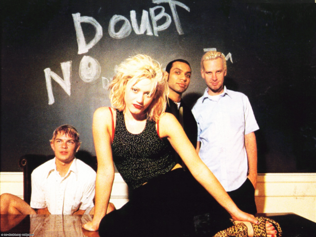
Another band similar to Snakes Hate Fire in terms of style and genre are No Doubt. Although No Doubt were around long before Snakes Hate Fire, they share some similarities of sound and the way they look as a band, such as No Doubt have 3 male members and 1 female lead singer, similar to that of SHF.
As I could not get an image of the website from when their last album was released I will compare the album cover and the magazine advert to their modern website.
The typography used on both the album cover and magazine advert is the same as they are both exactly the same image. The 'Old English' font gives the album cover and magazine advert a royal look, which ties in with the idea that this is a greatest hits album and they have come to the top of their career. Using the same font on both pieces of media helps create a brand identity as it is a unique font that potential buyers and fans will associate with the band and album. The black and white colour of the typography ties in with the black and white theme of all of their promotional material, also creating a brand identity. However, as the website is more modern it uses different typography, as No Doubt have recently reformed. The typography used on their website interestingly is the same as the typography used on the red sticker on the album, which shows that even thought the band have reformed they are still trying to link their new image with their old one to keep their audience attracted.
House Colours
There seems to be a theme of black, white and red across all of the promotional materials that I am analysing. Through research I have found that No Doubt have had these three colours incorporated into other albums of theirs as well, and as I am analysing their modern website I can see that this has transferred into modern day. The 2 main house colours are black and white, as seen on their album cover and magazine advert. This allows them to stand out from other artists, as they will usually use colourful images of bright, eye-catching colours to make people notice their material. No Doubt offers a different style for people to opt for. Red is used as an accent colour, as seen from the sticker on the album cover. This stands out on the black and white background and catches a potential buyers eye. This has also been used in other albums of theirs, such as 'Rock Steady':

House Colours
The album cover and the bands website use similar house colours in order to create a brand identity. They both share a cream/off-white neutral background, which may give the image of a calmer more mellow album. However, fans of the band know that their music is pop-rock and know that it is not calm sounding and therefore juxtaposes with the bands sound.
The magazine advert in contrast has a black and white theme and does not have any of the house colours seen in previous promotional material. Upon further research I found that this is because the image used in the magazine advert is actually the same image used for the single cover. Although the black and white is different to the soft creams and browns used as the house colours in other promotional material, they are still neutral colours and do not directly contrast with the album cover or website, going along with the natural colours theme.
Star Image Motifs and Style Features
Paramore have always used the same lower case Helvetica Neue Thin font for their band name on all promotional material, making it instantly recognisable to audiences. They do not use any symbols or recognisable images, however the band is recognised by the lead singer Hayley Wiliams' trademark bright red hair, which is oftern incorporated into promotional material such as using a bright orange font for the title of their last album 'Riot!'. Among the promotional material I am analysing here, the band have chosen to use a bright yellow butterfly with its wings detached not only on their album cover but on their website home page as well. The bright colour of the butterfly's wings contrasts with the cream/off-white background and makes it stand out, catching potential buyer's eyes. This seems to be a theme for the new album and acts as a recognisable image for the band as it would stay in your mind if you saw it in a magazine. Paramore have said that this image of a butterfly divided from its wings inspired the line "The angles were all wrong, now she's ripping wings off of butterflies" from their song 'Brick by Boring Brick' on the album.
Selling Music Using Artists Image?
The band have never used images of themselves for covers of their album, which is also shown in the album I am analysing today. They use the image of a butterfly with its wings detached throughout the promotional material, showing that they are trying to sell their music not their image. On their website the only images you see of the band are pictures from tour or stills from videos, not used as promotion. On the magazine advert and image of two ornaments on a curb is used instead of an image of the band themselves, this also shows that the band are well known and do not need images of themselves on the cover of their promotional material in order for it to sell, as the peaked at number 1 on the official UK Rock charts.
Another band similar to Snakes Hate Fire in terms of style and genre are No Doubt. Although No Doubt were around long before Snakes Hate Fire, they share some similarities of sound and the way they look as a band, such as No Doubt have 3 male members and 1 female lead singer, similar to that of SHF.

(best viewed in full screen)
No Doubt Promotion Material
View more presentations from EmmaPresland.
As I could not get an image of the website from when their last album was released I will compare the album cover and the magazine advert to their modern website.
Typography
The typography used on both the album cover and magazine advert is the same as they are both exactly the same image. The 'Old English' font gives the album cover and magazine advert a royal look, which ties in with the idea that this is a greatest hits album and they have come to the top of their career. Using the same font on both pieces of media helps create a brand identity as it is a unique font that potential buyers and fans will associate with the band and album. The black and white colour of the typography ties in with the black and white theme of all of their promotional material, also creating a brand identity. However, as the website is more modern it uses different typography, as No Doubt have recently reformed. The typography used on their website interestingly is the same as the typography used on the red sticker on the album, which shows that even thought the band have reformed they are still trying to link their new image with their old one to keep their audience attracted.
House Colours
There seems to be a theme of black, white and red across all of the promotional materials that I am analysing. Through research I have found that No Doubt have had these three colours incorporated into other albums of theirs as well, and as I am analysing their modern website I can see that this has transferred into modern day. The 2 main house colours are black and white, as seen on their album cover and magazine advert. This allows them to stand out from other artists, as they will usually use colourful images of bright, eye-catching colours to make people notice their material. No Doubt offers a different style for people to opt for. Red is used as an accent colour, as seen from the sticker on the album cover. This stands out on the black and white background and catches a potential buyers eye. This has also been used in other albums of theirs, such as 'Rock Steady':

These house colours create a clear brand identity for the band, and if someone sees a magazine advert or album cover with these colours they will more than likely link it with No Doubt. We also see a use of these house colours on the bands website, with black and white being the main theme with accent colours of red in random links and text, showing that they are still using this to keep up their brand identity today.
Star Image Motifs and Style Features
Much like Paramore, No Doubt do not seem to use any reoccurring icons or images in order to create a brand identity. However, they do seem to use pictures of themselves in all of the promotional material I have been analysing. This seems to show that the band are most recognisable by their image, in which lead singer Gwen Stefani shown up front standing out as the female lead singer in a male dominated band. Also, in most pictures I have seen in No Doubts promotional material, one of the male members of the band is either always looking at Gwen or looking away from the camera whilst the other members use direct address. This is interesting as in most band pictures either all band members would be looking at the camera or looking away from the camera, and this is another thing that makes No Doubt stand out and be different.
Selling music using artists image?
How will I attempt to create a brand identity for my artist?
Star Image Motifs and Style Features
Much like Paramore, No Doubt do not seem to use any reoccurring icons or images in order to create a brand identity. However, they do seem to use pictures of themselves in all of the promotional material I have been analysing. This seems to show that the band are most recognisable by their image, in which lead singer Gwen Stefani shown up front standing out as the female lead singer in a male dominated band. Also, in most pictures I have seen in No Doubts promotional material, one of the male members of the band is either always looking at Gwen or looking away from the camera whilst the other members use direct address. This is interesting as in most band pictures either all band members would be looking at the camera or looking away from the camera, and this is another thing that makes No Doubt stand out and be different.
Selling music using artists image?
As I have noted previously, No Doubt tend to use pictures of themselves on most of their promotional material and especially in the material that I have been analysing. However, as this is a greatest hits album it would make sense to have the band on the front because it allows fans both old and new to recognise that they have bought out a singles compilation. On the other hand, this gives the impression that No Doubt are trying to promote their music through their image as if it would not be as successful if they were just selling it without their image, as if they are not well known enough.
How will I attempt to create a brand identity for my artist?
If I were to use 'Heartbreak Beautiful' I would use a theme or star image motif of split screens. This is because this will be a prominent part of my music video, and I want to continue that by making the album cover split into two images, and also use this as part of a magazine advert. I also aim to maintain the same typography throughout my promotional materials, as I have seen this has been successful for Paramore. As the band have split up I will be unable to take shots photos of them for any promotional material, so I will be using either images of my character from the video or images that could be linked with the different situations of the video. As the album would be called 'Heartbreak Beautiful' I would want to have one side of the album as a sad image for 'Heartbreak' and the other side of the album cover as a happy image for 'Beautiful'. I feel like this is an inventive idea as through my own research I have yet to find an album cover or any promotional material that uses split screens quite like this.
If I were to use 'Innocent' I would make my theme or star image motif close-ups or medium close-ups of my character from the music video, using light house colours to promote the connotations of 'Innocent'. I feel like the music video would be very character orientated, fixed on the idea of the girl getting over her boyfriend and therefore I would want her to be heavily featured in the promotion. The last shot of the music video would be the girl walking away from the camera, linking arms with her friends and looking back as she says the line "Cos I'm all I need". This may be a good image to use for the front cover of my album as I have yet to see anything like this for other album covers. The girl would be using direct address looking straight into the camera to connect with the potential buyers which makes it eye catching, this is a technique I have seen No Doubt do with their promotional material. The fact that it would just be the main girl character turning her head round to look at the camera with the rest of her friends looking the other way is also similar to No Doubt's use of direct and indirect address. Much like 'Heartbreak Beautiful' I would also aim to use the same typography throughout the promotional material in order to create a brand identity.
If I were to use 'Innocent' I would make my theme or star image motif close-ups or medium close-ups of my character from the music video, using light house colours to promote the connotations of 'Innocent'. I feel like the music video would be very character orientated, fixed on the idea of the girl getting over her boyfriend and therefore I would want her to be heavily featured in the promotion. The last shot of the music video would be the girl walking away from the camera, linking arms with her friends and looking back as she says the line "Cos I'm all I need". This may be a good image to use for the front cover of my album as I have yet to see anything like this for other album covers. The girl would be using direct address looking straight into the camera to connect with the potential buyers which makes it eye catching, this is a technique I have seen No Doubt do with their promotional material. The fact that it would just be the main girl character turning her head round to look at the camera with the rest of her friends looking the other way is also similar to No Doubt's use of direct and indirect address. Much like 'Heartbreak Beautiful' I would also aim to use the same typography throughout the promotional material in order to create a brand identity.
Subscribe to:
Posts (Atom)