Paramore
(Paramore)

(Snakes Hate Fire)

(Paramore)

(Snakes Hate Fire)

A band similar to that of Snakes Hate Fire in regards to genre and style is Paramore. Much like Paramore, Snakes Hate Fire are a pop-rock band formed of 4 male members and 1 female member. I have analysed 3 different forms of promotion by Paramore - their album cover, website and a magazine advertisement for their album, in order to see how they have created a brand identity across all these promotional products.
(best viewed in full screen)
Paramore Promotional Material
View more presentations from EmmaPresland.
I was unable to find a magazine advert for their album, however I found a magazine advert for the first single off of their new album 'Ignorance'.
Typeface
The typeface for the album cover and the magazine advert are both the same, but in different colours. The band name is in the same font (Helvetica Neue Thin) and the track/album title is in the same font (Edwardian Script ITC). This allows an audience to link the magazine advert for the single with the album. Both of the titles of the magazine advertisement and the album cover seem to be set in the corners, however the band name seems to be larger than anything else, which seems to suggest that people will be more likely to recognise the band name than the album or single title. This is also done as the images used on both sets of promotional material is not a picture of the band, but a random image, therefore the band name needs to be more eye catching for potential buyers.
However, when looking at the bands website I find the typeface is completely different to that of the album cover and the magazine advert, which is unusual when trying to create a brand identity. This 'typewriter-esque' font is found on no other forms of promotion, even when further inspecting the back cover of the album:

The typeface on the website does however tie in with the colour scheme of the website, and does not look out of place. The font is in capitals which makes it eye catching and has a sort of old fashioned look, which goes with the neutral colourisation of the album and website. This font is also a masculine looking font, which contrasts with the rather feminine colours used. On the other hand, using a masculine font would make sense as the band is male dominated. However, they have a female singer and the majority of their fanbase are female, and I feel like this is why they have tried to mix both femininity and masculinity.
House Colours
The album cover and the bands website use similar house colours in order to create a brand identity. They both share a cream/off-white neutral background, which may give the image of a calmer more mellow album. However, fans of the band know that their music is pop-rock and know that it is not calm sounding and therefore juxtaposes with the bands sound.
The magazine advert in contrast has a black and white theme and does not have any of the house colours seen in previous promotional material. Upon further research I found that this is because the image used in the magazine advert is actually the same image used for the single cover. Although the black and white is different to the soft creams and browns used as the house colours in other promotional material, they are still neutral colours and do not directly contrast with the album cover or website, going along with the natural colours theme.
Star Image Motifs and Style Features
Paramore have always used the same lower case Helvetica Neue Thin font for their band name on all promotional material, making it instantly recognisable to audiences. They do not use any symbols or recognisable images, however the band is recognised by the lead singer Hayley Wiliams' trademark bright red hair, which is oftern incorporated into promotional material such as using a bright orange font for the title of their last album 'Riot!'. Among the promotional material I am analysing here, the band have chosen to use a bright yellow butterfly with its wings detached not only on their album cover but on their website home page as well. The bright colour of the butterfly's wings contrasts with the cream/off-white background and makes it stand out, catching potential buyer's eyes. This seems to be a theme for the new album and acts as a recognisable image for the band as it would stay in your mind if you saw it in a magazine. Paramore have said that this image of a butterfly divided from its wings inspired the line "The angles were all wrong, now she's ripping wings off of butterflies" from their song 'Brick by Boring Brick' on the album.
Selling Music Using Artists Image?
The band have never used images of themselves for covers of their album, which is also shown in the album I am analysing today. They use the image of a butterfly with its wings detached throughout the promotional material, showing that they are trying to sell their music not their image. On their website the only images you see of the band are pictures from tour or stills from videos, not used as promotion. On the magazine advert and image of two ornaments on a curb is used instead of an image of the band themselves, this also shows that the band are well known and do not need images of themselves on the cover of their promotional material in order for it to sell, as the peaked at number 1 on the official UK Rock charts.
Another band similar to Snakes Hate Fire in terms of style and genre are No Doubt. Although No Doubt were around long before Snakes Hate Fire, they share some similarities of sound and the way they look as a band, such as No Doubt have 3 male members and 1 female lead singer, similar to that of SHF.
As I could not get an image of the website from when their last album was released I will compare the album cover and the magazine advert to their modern website.
The typography used on both the album cover and magazine advert is the same as they are both exactly the same image. The 'Old English' font gives the album cover and magazine advert a royal look, which ties in with the idea that this is a greatest hits album and they have come to the top of their career. Using the same font on both pieces of media helps create a brand identity as it is a unique font that potential buyers and fans will associate with the band and album. The black and white colour of the typography ties in with the black and white theme of all of their promotional material, also creating a brand identity. However, as the website is more modern it uses different typography, as No Doubt have recently reformed. The typography used on their website interestingly is the same as the typography used on the red sticker on the album, which shows that even thought the band have reformed they are still trying to link their new image with their old one to keep their audience attracted.
House Colours
There seems to be a theme of black, white and red across all of the promotional materials that I am analysing. Through research I have found that No Doubt have had these three colours incorporated into other albums of theirs as well, and as I am analysing their modern website I can see that this has transferred into modern day. The 2 main house colours are black and white, as seen on their album cover and magazine advert. This allows them to stand out from other artists, as they will usually use colourful images of bright, eye-catching colours to make people notice their material. No Doubt offers a different style for people to opt for. Red is used as an accent colour, as seen from the sticker on the album cover. This stands out on the black and white background and catches a potential buyers eye. This has also been used in other albums of theirs, such as 'Rock Steady':

House Colours
The album cover and the bands website use similar house colours in order to create a brand identity. They both share a cream/off-white neutral background, which may give the image of a calmer more mellow album. However, fans of the band know that their music is pop-rock and know that it is not calm sounding and therefore juxtaposes with the bands sound.
The magazine advert in contrast has a black and white theme and does not have any of the house colours seen in previous promotional material. Upon further research I found that this is because the image used in the magazine advert is actually the same image used for the single cover. Although the black and white is different to the soft creams and browns used as the house colours in other promotional material, they are still neutral colours and do not directly contrast with the album cover or website, going along with the natural colours theme.
Star Image Motifs and Style Features
Paramore have always used the same lower case Helvetica Neue Thin font for their band name on all promotional material, making it instantly recognisable to audiences. They do not use any symbols or recognisable images, however the band is recognised by the lead singer Hayley Wiliams' trademark bright red hair, which is oftern incorporated into promotional material such as using a bright orange font for the title of their last album 'Riot!'. Among the promotional material I am analysing here, the band have chosen to use a bright yellow butterfly with its wings detached not only on their album cover but on their website home page as well. The bright colour of the butterfly's wings contrasts with the cream/off-white background and makes it stand out, catching potential buyer's eyes. This seems to be a theme for the new album and acts as a recognisable image for the band as it would stay in your mind if you saw it in a magazine. Paramore have said that this image of a butterfly divided from its wings inspired the line "The angles were all wrong, now she's ripping wings off of butterflies" from their song 'Brick by Boring Brick' on the album.
Selling Music Using Artists Image?
The band have never used images of themselves for covers of their album, which is also shown in the album I am analysing today. They use the image of a butterfly with its wings detached throughout the promotional material, showing that they are trying to sell their music not their image. On their website the only images you see of the band are pictures from tour or stills from videos, not used as promotion. On the magazine advert and image of two ornaments on a curb is used instead of an image of the band themselves, this also shows that the band are well known and do not need images of themselves on the cover of their promotional material in order for it to sell, as the peaked at number 1 on the official UK Rock charts.
Another band similar to Snakes Hate Fire in terms of style and genre are No Doubt. Although No Doubt were around long before Snakes Hate Fire, they share some similarities of sound and the way they look as a band, such as No Doubt have 3 male members and 1 female lead singer, similar to that of SHF.

(best viewed in full screen)
No Doubt Promotion Material
View more presentations from EmmaPresland.
As I could not get an image of the website from when their last album was released I will compare the album cover and the magazine advert to their modern website.
Typography
The typography used on both the album cover and magazine advert is the same as they are both exactly the same image. The 'Old English' font gives the album cover and magazine advert a royal look, which ties in with the idea that this is a greatest hits album and they have come to the top of their career. Using the same font on both pieces of media helps create a brand identity as it is a unique font that potential buyers and fans will associate with the band and album. The black and white colour of the typography ties in with the black and white theme of all of their promotional material, also creating a brand identity. However, as the website is more modern it uses different typography, as No Doubt have recently reformed. The typography used on their website interestingly is the same as the typography used on the red sticker on the album, which shows that even thought the band have reformed they are still trying to link their new image with their old one to keep their audience attracted.
House Colours
There seems to be a theme of black, white and red across all of the promotional materials that I am analysing. Through research I have found that No Doubt have had these three colours incorporated into other albums of theirs as well, and as I am analysing their modern website I can see that this has transferred into modern day. The 2 main house colours are black and white, as seen on their album cover and magazine advert. This allows them to stand out from other artists, as they will usually use colourful images of bright, eye-catching colours to make people notice their material. No Doubt offers a different style for people to opt for. Red is used as an accent colour, as seen from the sticker on the album cover. This stands out on the black and white background and catches a potential buyers eye. This has also been used in other albums of theirs, such as 'Rock Steady':

These house colours create a clear brand identity for the band, and if someone sees a magazine advert or album cover with these colours they will more than likely link it with No Doubt. We also see a use of these house colours on the bands website, with black and white being the main theme with accent colours of red in random links and text, showing that they are still using this to keep up their brand identity today.
Star Image Motifs and Style Features
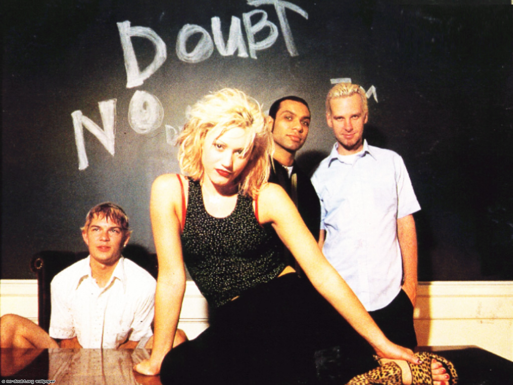
Much like Paramore, No Doubt do not seem to use any reoccurring icons or images in order to create a brand identity. However, they do seem to use pictures of themselves in all of the promotional material I have been analysing. This seems to show that the band are most recognisable by their image, in which lead singer Gwen Stefani shown up front standing out as the female lead singer in a male dominated band. Also, in most pictures I have seen in No Doubts promotional material, one of the male members of the band is either always looking at Gwen or looking away from the camera whilst the other members use direct address. This is interesting as in most band pictures either all band members would be looking at the camera or looking away from the camera, and this is another thing that makes No Doubt stand out and be different.
Selling music using artists image?
How will I attempt to create a brand identity for my artist?
Star Image Motifs and Style Features
Much like Paramore, No Doubt do not seem to use any reoccurring icons or images in order to create a brand identity. However, they do seem to use pictures of themselves in all of the promotional material I have been analysing. This seems to show that the band are most recognisable by their image, in which lead singer Gwen Stefani shown up front standing out as the female lead singer in a male dominated band. Also, in most pictures I have seen in No Doubts promotional material, one of the male members of the band is either always looking at Gwen or looking away from the camera whilst the other members use direct address. This is interesting as in most band pictures either all band members would be looking at the camera or looking away from the camera, and this is another thing that makes No Doubt stand out and be different.
Selling music using artists image?
As I have noted previously, No Doubt tend to use pictures of themselves on most of their promotional material and especially in the material that I have been analysing. However, as this is a greatest hits album it would make sense to have the band on the front because it allows fans both old and new to recognise that they have bought out a singles compilation. On the other hand, this gives the impression that No Doubt are trying to promote their music through their image as if it would not be as successful if they were just selling it without their image, as if they are not well known enough.
How will I attempt to create a brand identity for my artist?
If I were to use 'Heartbreak Beautiful' I would use a theme or star image motif of split screens. This is because this will be a prominent part of my music video, and I want to continue that by making the album cover split into two images, and also use this as part of a magazine advert. I also aim to maintain the same typography throughout my promotional materials, as I have seen this has been successful for Paramore. As the band have split up I will be unable to take shots photos of them for any promotional material, so I will be using either images of my character from the video or images that could be linked with the different situations of the video. As the album would be called 'Heartbreak Beautiful' I would want to have one side of the album as a sad image for 'Heartbreak' and the other side of the album cover as a happy image for 'Beautiful'. I feel like this is an inventive idea as through my own research I have yet to find an album cover or any promotional material that uses split screens quite like this.
If I were to use 'Innocent' I would make my theme or star image motif close-ups or medium close-ups of my character from the music video, using light house colours to promote the connotations of 'Innocent'. I feel like the music video would be very character orientated, fixed on the idea of the girl getting over her boyfriend and therefore I would want her to be heavily featured in the promotion. The last shot of the music video would be the girl walking away from the camera, linking arms with her friends and looking back as she says the line "Cos I'm all I need". This may be a good image to use for the front cover of my album as I have yet to see anything like this for other album covers. The girl would be using direct address looking straight into the camera to connect with the potential buyers which makes it eye catching, this is a technique I have seen No Doubt do with their promotional material. The fact that it would just be the main girl character turning her head round to look at the camera with the rest of her friends looking the other way is also similar to No Doubt's use of direct and indirect address. Much like 'Heartbreak Beautiful' I would also aim to use the same typography throughout the promotional material in order to create a brand identity.
If I were to use 'Innocent' I would make my theme or star image motif close-ups or medium close-ups of my character from the music video, using light house colours to promote the connotations of 'Innocent'. I feel like the music video would be very character orientated, fixed on the idea of the girl getting over her boyfriend and therefore I would want her to be heavily featured in the promotion. The last shot of the music video would be the girl walking away from the camera, linking arms with her friends and looking back as she says the line "Cos I'm all I need". This may be a good image to use for the front cover of my album as I have yet to see anything like this for other album covers. The girl would be using direct address looking straight into the camera to connect with the potential buyers which makes it eye catching, this is a technique I have seen No Doubt do with their promotional material. The fact that it would just be the main girl character turning her head round to look at the camera with the rest of her friends looking the other way is also similar to No Doubt's use of direct and indirect address. Much like 'Heartbreak Beautiful' I would also aim to use the same typography throughout the promotional material in order to create a brand identity.
No comments:
Post a Comment